CREATE HIGHLIGHT
Step 1 New document, gradient background

|
| New Document Dialog 1900 x 1280 |
I decided to go large, as in the original tutorial, and size it down after completion. At first I was annoyed at having to create a 2nd gradient, why not just add the yellow to the gradient, ie yellow to brown to black? The answer is because the yellow gradient is on a separate layer with opacity scaled down to 20%. If you can figure out the color that is brown with 20% opaque yellow on it, you can make a single gradient. Since this involves too much backtracking, it's much more simple to make 2 gradients.
Brown 7d553c
 to Black 000000

 to Black 000000

Dark Yellow d7af3c
 to Transparent

 to Transparent

Step 2 Text (script, large, color)
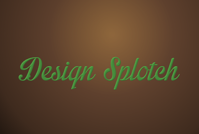
Problem: a deplorable lack of script fonts on my system. So I went to my go-to source: Dafont.com. Coworkers first recommended them to me back in the days when my day job involved graphic design (pre 2008), and they are still around. I like their custom preview that lets you type in some text and preview it in the chosen font before download / purchasing. So. Pick something nice and scripty. I chose a green color because I like high contrast when I'm editing. We will change the color later, so it's not really critical what color you pick.
Step 3 Duplicate text layers.
Create a duplicate layer. For clarity, I renamed the original (bottom) text layer to "Original Text". Change the color of the text on the duplicate layer to the highlight color, dark yellow. Create some more duplicate layers - I did 4 total, each one offset up and left. I used the arrow keys to nudge each layer 2 steps up, 2 steps left.
Step 4 Discard Text Information (raster) all text layers except Original Text layer. Merge into 1 layer. Rename layer to Text Highlight.
Step 5 Punch out text
Select the alpha of Original Text. With Text Highlight layer selected and Original Text alpha as the selection, press delete. We now have something rather like a drop shadow with the foreground punched out.

|
|
If you made 4 layers like me, then arrow key 8 times down, 8 times right. The highlight should now align with the top left corner of Original Text.
Step 7 Gaussian blur Text Highlight. The default settings are fine.
Step 8 Create layer mask.
Select Original Text alpha again. Right click Text Highlight and choose Add Layer Mask... Choose Selection from the list and click Add button. Now the highlight appears ONLY over our text.

|

|
CREATE THE REST
Step 1 Create a duplicate layer of Original Text. Here would be a place to use some forethought and choose a text color that's not too dark. I stuck with my original green color as I was experimenting, and it happened to be a pretty good choice. Discard Text Information. At this point it's much harder to change the color, which is why working on a duplicate layer is a good idea. Also turned off visibility of Text Highlight layer for now, so we can focus on the text underneath.
Step 2 Filter: Decor: Add Bevel. Experiment with settings until you are happy with how it looks. Work on copy creates an exact copy of the whole image (layers and all). Not sure why that's useful, so I turned it off. Rename the layer to "Bevel". At right are the filter settings I used:
Step 3 Hard Light Mode
Create a duplicate of Bevel. Set color mode to Hard Light. Depending on your colors, may need to use other modes, experiment till you find something you like. Hard Light tends to create a neon effect, which is why it doesn't work as well with darker colors. Rename the layer to Hard Light #1.
Step 5 Make Text Highlight layer visible, and on top of the layer stack.
Step 6 Create a duplicate of Original Text layer. Select all text with the text tool. Change the color to brown (7d553c). Set Mode to Color. Rename the layer to Color Mode. Move to the very top in the layer stack.
Step 7 Drop Shadow
Select Original Text layer and run Filter: Light and Shadow: Drop Shadow (creates a new layer so you don't need to make duplicate of Original Text first). Shadows add a LOT to the finished image.
Step 7 Fiddle-dee-dee
WHY is there green showing?!?! Whywhywhy??? The difference between the smoothness of text and the jaggedness of turning text into a selection? Maybe Text Highlight is not exactly perfectly lined up? Grr! So, I cheated. I selected the Original Text alpha and expanded the selection by 1px and filled it in with brown on the Color Mode layer.
TA DA!
It's not quite as cool as the original, it's a lot more fiddly to create, and doesn't lend itself to backtracking very well, but I'm still satisfied with the finished result. Mostly.
Let me know your comments (and suggestions - constructive criticism only please!)
ENJOY!


No comments:
Post a Comment